
Introduction
With over 60% of web traffic now coming from mobile devices, the way we design and present mobile navigation menus has become more critical than ever.
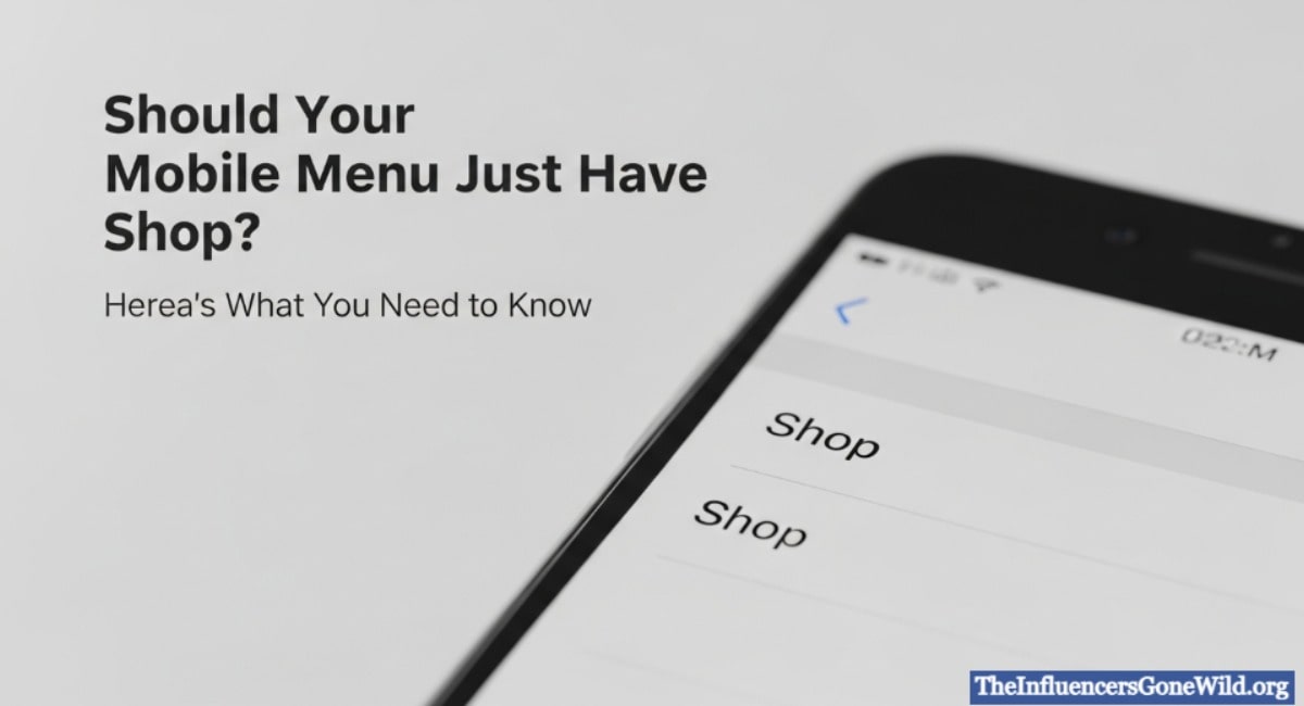
Some e-commerce websites are shifting to shop-only mobile menus, streamlining the experience for users focused solely on shopping.
But is this minimalist approach always beneficial? Or could it risk alienating users, harming SEO, and reducing engagement?
This article explores the implications, pros, cons, and best practices surrounding the idea of limiting mobile menus to just the “Shop” section. We’ll dive into usability, SEO, user behavior, and expert insights to help you make informed decisions.
Pros of a Shop-Only Mobile Menu

1. Streamlined Focus on Conversion
Having only the “Shop” in the mobile menu simplifies the user journey and funnels visitors directly to products. This can potentially:
- Increase click-through rates to product pages
- Speed up the customer decision-making process
- Reduce distractions for transactional visitors
2. Improved Load Time
With fewer items in the menu, the HTML, CSS, and JavaScript load faster. This results in:
- Faster mobile performance
- Better Core Web Vitals scores
- Potential ranking improvement
3. Clean Design Aesthetic
A minimalistic menu aligns with modern UI/UX trends, which value clarity and simplicity. This can:
- Improve user perception
- Reduce cognitive load
- Align with high-end brand identities
Cons of a Shop-Only Mobile Menu
1. Limited Discovery
Users seeking information—such as about pages, blogs, contact info, FAQs, return policies, or careers—might get frustrated if these links are hidden or entirely omitted.
2. Poor SEO Structure
Search engines use your internal linking and site architecture to understand content hierarchy. A single-menu link limits crawlability and can:
- Reduce content indexing
- Weaken topical authority
- Lower search rankings for non-product pages
3. Damaged Brand Experience
Your website is often the first brand touchpoint. Restricting user access to just products makes your brand feel like a commodity, not a full experience.
“Navigation isn’t just functional—it’s emotional. It reflects how you value your users’ curiosity.” – UX Expert Jared Spool
Understanding Mobile User Intent
What Are Users Looking for on Mobile?
Studies show mobile users often search for:
- Products or services (transactional intent)
- Contact details or location (navigational intent)
- Educational content (informational intent)
- Trust signals (about, testimonials, reviews)
User Types and Their Needs
| User Type | Likely Intent | Needs Beyond Shop? |
| First-time visitors | Explore, learn about the brand | Yes |
| Returning customers | Reorder, track order, contact support | Yes |
| Browsers | Just exploring products casually | Possibly |
| Buyers in a hurry | Buy a specific item quickly | No |
Behavioral Data Insight
According to Baymard Institute, 61% of mobile users abandon sites with unclear navigation. A shop-only menu risks confusing and deterring these users.
Alternative Menu Structures
1. Expandable Shop Section with Additional Links
Structure:
- Shop (Main category)
- About Us
- Blog / Learn
- Contact / Support
- FAQ
This gives users easy access to essential pages while keeping the primary focus on shopping.
2. Sticky Bottom Navigation (Tab Bar)
A design trend popularized by mobile apps. Example layout:
- Home | Categories | Cart | Support | Profile
Benefits:
- Always accessible
- Optimized for thumb navigation
- Improves retention and UX
3. Progressive Disclosure
Initially show “Shop” but include a ‘More’ dropdown revealing secondary links. This preserves minimalism while providing depth.
Expert Opinions on Mobile Menu Design
Nielsen Norman Group
“Navigation should be discoverable, accessible, and flexible. Minimal isn’t always better—it’s about relevance.”
Google’s SEO Guidelines
Google advises clear site architecture for better crawling. Hiding key content behind a single menu item can hinder:
- Indexing
- Contextual relationships
- SERP visibility for non-product content
When a Shop-Only Menu Might Be OK
There are edge cases where a “Shop-only” mobile menu could work:
- Single-product websites (e.g., AirPods landing page)
- Limited-time campaign sites (e.g., Black Friday microsites)
- Minimalist luxury brands are aiming for an ultra-streamlined experience
Even then, footer links or contextual buttons should provide access to legal pages, support, and content that builds trust.
Actionable Recommendations
Do This
- Conduct mobile user testing before changing navigation
- Use heatmaps to track menu engagement
- Prioritize clarity over extreme minimalism
- Use internal links within page content to support SEO
- Provide footer navigation for key secondary page
Avoid This
- Don’t hide essential pages like Contact, FAQ, or About
- Don’t rely solely on search bars for navigation
- Don’t assume all users only want to shop
Real-World Examples
Success – Warby Parker
Their mobile site features a simple menu but includes:
- Shop
- Home Try-On
- About
- FAQ
- Support
This helps new users build trust while keeping the focus on shopping.
Failure – A Niche Fashion Store
They implemented a “Shop-only” menu. Their bounce rate spiked by 25%, and customer support tickets asking “how to contact you” doubled. Restoring the About and Contact pages reduced confusion and improved engagement.
Conclusion
While it’s tempting to simplify navigation for mobile users by showing just the “Shop” option, doing so often undermines user trust, SEO, and brand storytelling.
A well-designed mobile menu should reflect the diverse needs and intents of your users, not just your sales goals.
Aim for a hybrid approach, where shopping remains the core action, but essential brand and support links remain accessible.
Design for humans, not just algorithms.
FAQs
Should a mobile menu only include the shop?
No, unless your site is a single-product store or campaign page. Most users expect to find support, trust, and information pages as well.
What links should be in a mobile menu?
Essential links include:
- Shop / Categories
- About Us
- Contact / Support
- FAQ
- Blog or Learning Resources
Is hiding menu items bad for SEO?
Yes. Google relies on internal linking to understand site structure. Hiding pages from the menu can reduce crawlability and visibility.
What’s better for mobile: hamburger menu or bottom nav?
Bottom navigation bars offer faster access for thumb use but might not scale well with many items. Hamburger menus are flexible but require extra taps.
Can I put secondary links in the footer only?
Yes, as long as the footer is accessible and the links are structured properly with HTML (not hidden behind JavaScript).